Overview
You don’t need more videos. You need one great master video, then the right versions for where people will actually watch it.
At ListLift, we build a strong photo-to-video promo once—and deliver the cutdowns and formats that help you use it everywhere: real estate platforms, your website, and social media.
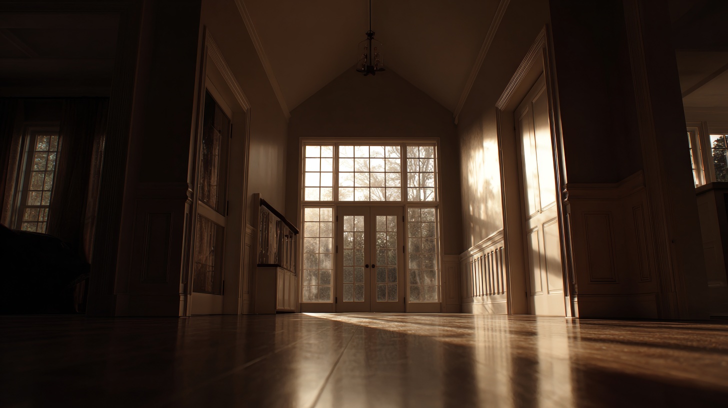
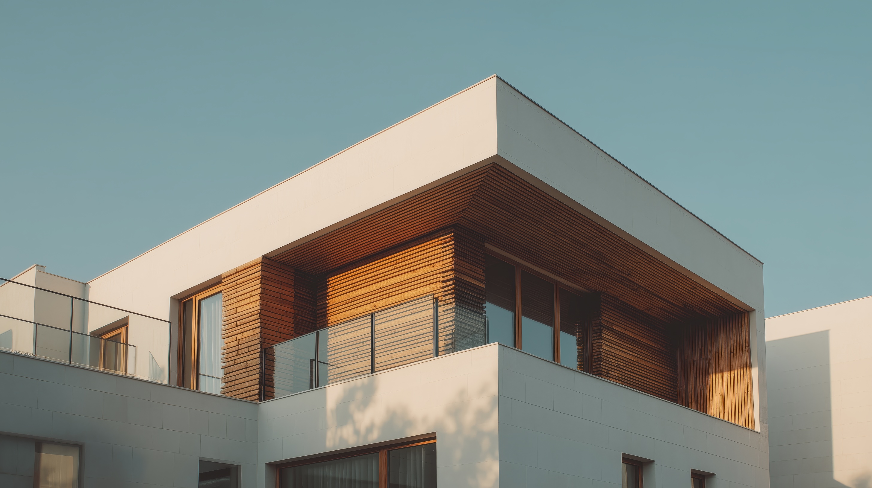
Step 1: Make one master video (your “truth” version)
Your master is the full story. It should feel complete and premium.
Best master length: 60 seconds
Why 60 seconds works:
- Enough time to show the property flow (arrival → key rooms → highlights → finish)
- Perfect for websites, presentations, and “full tour” placements
- Gives you the source material for shorter edits
Step 2: Create 2–3 cutdowns (so you can use it everywhere)
60 seconds — The Tour
Use it for: listing pages, your website, YouTube/Vimeo, email follow-ups
Goal: show the full experience and build confidence
Best when: the property needs context (layout, multiple selling points)
15 seconds — The Ad
Use it for: Reels/TikTok/Shorts ads and quick social pushes
Goal: one hook + one wow + one action
Best when: you’re trying to stop the scroll and drive clicks/messages
Optional (but powerful)
- 30 seconds — The “best of both” (great for organic social and warm audiences)
- 6 seconds — The bumper (ultra-short awareness and retargeting)
Simple rule:
60 seconds sells the property. 15 seconds sells the click.
Step 3: Export the right formats (so nothing gets cropped or covered)
The 2026 core formats
You only need a few exports to cover almost everything:
16:9 (Landscape)
Best for: websites, YouTube standard video, presentations, screens
Why: looks premium, matches web layouts, feels cinematic
9:16 (Vertical)
Best for: TikTok, Instagram Reels/Stories, YouTube Shorts
Why: these platforms are built for vertical-first viewing and performance
4:5 (Portrait feed)
Best for: Instagram and LinkedIn feeds
Why: takes up more screen space in-feed than landscape without going full vertical
Step 4: Keep your text and logo inside safe zones
On Reels/TikTok/Shorts, platform UI covers parts of the screen (captions, buttons, profile icons). Use this simple rule to avoid covered text:
- Keep your main subject centered
- Put text in the middle third, not at the very top or bottom
- Avoid placing logos/CTAs near the right edge (buttons often live there)
A simple “one master → many outputs” package (what to ask for)
Cutdowns
- 60s tour
- 30s highlight (optional)
- 15s ad
- 6s bumper (optional)
Formats
- 16:9 (web + premium)
- 9:16 (TikTok/Reels/Shorts)
- 4:5 (feed)
Biggest mistake to avoid
Don’t take a 16:9 video and crop it into vertical after the fact. Vertical should be framed like vertical from the start—otherwise you lose key property details and your text can get cut off.